Vincenzo Manto
Founder @ Datastripes

Vincenzo is the visionary behind Datastripes, blending his passion for data with a knack for innovation. With a background in Computer Science Engineering at @PoliMi University, he has a unique ability to turn complex data challenges into elegant solutions. His leadership drives the team to create intuitive, powerful tools that make data accessible to everyone.

View all authors

The AI Battle for Data: Datastripes vs. Vibechart

· 5 min read
Vincenzo Manto
Founder @ Datastripes

In recent years, we've all heard about the impact of artificial intelligence. But for those who work with data, this is no longer a futuristic theory—it's a reality that is rewriting the rules of the game. AI is no longer just a tool, but a true co-pilot: a silent partner that is revolutionizing the way we discover insights, create reports, and make decisions.

Two names stand out in defining the future of this field, each with a distinct vision: Vibechart and Datastripes.
I had the privilege of analyzing a Datastripes demo and, after much thought, decided it was time to compare these two emerging giants.
This is not just a simple comparison, but an analysis of two different philosophies that promise to forever change our relationship with data.

We want to give your data a voice, literally

· 5 min read
Vincenzo Manto
Founder @ Datastripes

"Our CEO never looks at dashboards. He just asks for a short summary at the end of every week."

This was a moment of clarity for us.

We’ve spent months building a data tool that’s flexible, visual, intelligent. Something that lets you shape your data into clean flows, insightful graphs, and compelling visualizations. And yet, at the end of that pipeline, the point where decisions are made, too many insights get stuck.

They don’t get shared. Or they get dumped into a slide deck. Or a PDF report that no one opens.

The value of the insight gets lost in the medium.

This is what inspired us to build the Podcast Node, a simple, powerful way to convert the output of any data flow into a natural, spoken summary. So even if someone won’t look at the dashboard, they can still hear the story.


Data must be consumed, not just displayed

The Podcast Node is a new type of output node in Datastripes. It’s designed for one job:

Take the result of a data flow and turn it into an audio narrative you can share.

It’s not just a gimmick. It’s a shift in how data can be consumed.

With the rise of remote work, async updates, busy execs, and shrinking attention spans, the ability to listen to data instead of reading it is more relevant than ever.

And while text-to-speech isn’t new, what we’ve done here is different:

  • The Podcast Node is deeply connected to the logic of your data flow.
  • You control the context and tone with natural language prompts.
  • The output isn’t generic. It’s targeted, insightful, and based on the exact data you define.

But, how it works

Podcast Node in Action

Using the Podcast Node is simple, but surprisingly powerful.

  1. Build your flow, Prep your dataset, apply logic, generate summaries or visualizations.

  2. Drag in a Podcast Node, From the nodes library, add a Podcast Node to the canvas.

  3. Connect it to any upstream node, A summary table, a trend insight, a final output.

  4. Write a prompt, Tell the system what to generate. For example:

    "Give a 90-second update on user engagement over the last 30 days. Use a clear, neutral tone."

  5. Generate the audio, In seconds, you’ll get a natural voice summary.

  6. Download and share, As a standard audio file (.mp3 or .wav)

No scripts. No recording tools. No waiting.

Just clean, spoken insights, instantly.


So, why this solves a real problem

We didn’t build this to impress with AI. We built it because it solves a real communication problem:

  • Dashboards are powerful, but passive.
  • Reports are dense, and easy to ignore.
  • Data teams often struggle to bridge the gap between analysis and action.

The Podcast Node adds a bridge. It gives your insights a voice.

Imagine being able to:

  • Send a weekly product update as a short audio clip
  • Share quarterly revenue analysis with your CFO without a deck
  • Deliver campaign performance summaries that people actually pay attention to
  • Let a stakeholder review metrics while commuting

Where and when use it

Since launching the node internally and with a few early users, we’ve seen it used in:

  • Sales: Weekly summaries of pipeline status sent to sales leads
  • Marketing: Campaign retrospectives delivered as short briefings
  • Product: Usage trends turned into podcast clips for internal syncs
  • Agencies: Client reports in audio form to supplement the usual PDF

In all of these cases, the result was the same: higher engagement, faster understanding, and more feedback.

It’s not magic. It’s just more human.


Writing Effective Prompts

The prompt is where you shape the voice and focus of the summary.

Some best practices:

  • Be clear on timeframe: “this month,” “last quarter,” “past 7 days”
  • State your goal: “summarize,” “highlight,” “explain anomalies”
  • Define the tone: “neutral,” “friendly,” “professional,” “casual”
  • Limit the length: 60–120 seconds works best

Examples:

  • “Give a friendly summary of revenue changes from last month, highlighting major drops or spikes.”
  • “Explain changes in user churn from Q1 to Q2. Use simple language.”
  • “Summarize the customer support trends in under 2 minutes.”

No Setup. No Backend. Full Privacy.

Like everything in Datastripes, the Podcast Node runs entirely in your browser.

That means:

  • No data ever leaves your machine
  • No backend processing
  • No need to upload or store audio externally

Your flow stays local. So does your voice.


What’s Next

We’re currently experimenting with:

  • Multi-language support
  • Automated publishing (e.g., send podcast to Slack or email)
  • Voice customization
  • Recurring podcast generation from a scheduled flow

If you have ideas, we’re all ears.


Try It Yourself

The Podcast Node is available now in early access at datastripes.com.

Just sign up, build your first flow, and give it a voice.

If your data has something to say, maybe it’s time you let it speak.

KNIME vs DataStripes

· 4 min read
Vincenzo Manto
Founder @ Datastripes

slug: knime-vs-datastripes-modern-data-workflow-automation title: KNIME vs DataStripes authors: [Vincenzo Manto] description: Why DataStripes is the modern, UX-first alternative to KNIME for building data pipelines, automations, and integrations entirely in your browser.

KNIME is a powerhouse for enterprise-level data science. But if you're a modern builder looking for simplicity, speed, and beautiful browser-native workflows — DataStripes is for you.

Unifying ecosystems by integrating SAP, Business Central, and Shopify

· 6 min read
Vincenzo Manto
Founder @ Datastripes

In today's complex business landscape, data often resides in silos. For many organizations, the challenge is bringing together powerful ERP systems like SAP, agile mid-market solutions like Microsoft Dynamics 365 Business Central, and e-commerce giants like Shopify. The goal? A unified view of operations that drives efficiency and growth.

The Unprecedented Value of near-native analytics

· 5 min read
Vincenzo Manto
Founder @ Datastripes
Alessia Bogoni
Chief Data Analyist @ Datastripes

Sometimes, there aren't just technical upgrades but game-changer for users. We've dug deep, made some incredible improvements, and what that means for you is a huge, undeniable competitive edge and real, tangible value for your company and, most importantly, for your users.


Experience Analytics Like Never Before: It's Like Having a Desktop App Right in Your Browser

Remember how frustrating it used to be? Your application felt slow, the screen would freeze, you'd wait forever, and sometimes the browser would even crash, even with just a moderate amount of data. It made your app feel like a "limited web solution."

Well, forget all that. Now, you can offer an incredibly smooth, instant, and super responsive data analytics experience, right there in the browser. Your users will feel like they're using a powerful, professional tool, something that truly rivals dedicated desktop software or those complex, expensive Business Intelligence platforms. And the best part? No annoying installations, no tricky setups – just pure, unadulterated analytical power. This immediately puts you light years ahead of competitors still stuck with those less optimized, pure JavaScript solutions. We're not just improving; we're redefining what web-based analytics can do.


Break Free from Data Limits: Unprecedented Scalability Right on Your User's Device

Before, your application was held back. There was this frustrating limit on how much data you could really handle, which meant you were missing out on potential clients who needed to analyze massive datasets. You were leaving a lot of market opportunity on the table.

Now? Those limits are gone. Your application can now process hundreds of thousands, even millions of records, directly within your client's browser. This isn't just an upgrade; it's a massive expansion of your market potential. It means you can now serve entire new segments and clients with the most complex, data-heavy needs – clients who previously would've been forced to buy into expensive, server-based solutions. Your app isn't just an alternative; it's a smarter, leaner, and much more cost-effective choice for serious data work.


Supercharge Your Profits: Drastically Lower Costs and Boosted Margins

Think about it: tackling complex analyses on big datasets used to mean investing in costly server infrastructure – APIs, databases, analytics engines – just to process data on the backend. It wasn't just an expense; it was a constant drain on your money and resources.

Imagine the relief now. By cleverly moving all that analytical intelligence directly to the client's device, you can drastically reduce or even completely eliminate the need for dedicated servers for these heavy operations. This isn't just about saving money; it's a huge financial win. We're talking about massive savings on hosting, bandwidth, ongoing maintenance, and all that complex backend development. All of this directly translates into significantly better operating margins and sets your business up for unparalleled long-term sustainability. It's not just cutting costs; it's making your business far more profitable.


Your Data is Safe: Security and Compliance Become Your Unique Selling Point

Remember the worry? Every time data moved to a backend server for analysis, it created a weak point. It added more complexity for crucial compliance rules like GDPR. Your data's journey was always a bit risky.

Now, you can relax. With our improvements, your users' data never, ever leaves their device. All the processing happens entirely on their machine. This isn't just a security feature; it's a fortress of privacy and protection. No data moving around, no data sitting on your servers. This powerful assurance isn't just a technical detail; it's a decisive selling point that truly resonates with clients in highly regulated industries or those who demand top-level confidentiality. When data breaches are everywhere, your commitment to on-device processing becomes an unbeatable advantage.


Work Anywhere, Anytime: Offline-First Capability Means Uninterrupted Workflow

Before, your analytics features were tied to an internet connection. No internet meant no work, leading to frustration and lost productivity.

Now, experience true freedom. Once your application loads, analysis can be done seamlessly, even without an internet connection. This isn't just a nice-to-have; it's a massive, transformative benefit for users who are on the go, in areas with spotty internet, or anyone who simply wants to work without interruption. It's all about giving your users unfettered access to their insights, whenever and wherever they need them.


Build Faster, Innovate Quicker: Simpler Architecture Means Rapid Development

Facing the sheer complexity of an analytical backend used to mean specialized teams and long, often painful, development cycles. Innovation was constantly slowed down by intricate system designs.

Now, supercharge your development process! The ability to run complex analytical SQL directly in the frontend with DuckDB-WASM hugely simplifies your application's overall design. This incredible simplification frees up your development team, allowing them to focus intensely on core business logic and creating amazing new features. The result? A dramatic reduction in how long it takes to bring new analytical features to market, ensuring you always stay ahead of the competition.


In a nutshell: Your future just got a whole lot brighter.

These technical innovations aren't just small steps; they're a giant leap forward. They let you offer a product that's not only faster, stronger, and incredibly secure but also much cheaper to run. With a user experience that truly blows the competition out of the water, these advancements open up exciting new market opportunities and build deeper, lasting loyalty with your customers.

Ready to see how this can transform your business? Let's chat and show you how these innovations will redefine your success!

Our bet on exploring Data without code

· 5 min read
Vincenzo Manto
Founder @ Datastripes

Our unspoken truth about Data Analysis

Most data tools weren’t built for you. They were designed for analysts, engineers, and data scientists—people who think in code, not questions. For everyone else, it’s like trying to do surgery with boxing gloves.

You’re often handed a beautiful dashboard, but when you want to dig deeper, you're stuck. You’re expected to extract insight without the means to explore freely. The data is there, but it’s locked behind layers of filters, dropdowns, and queries that don’t reflect how you actually think.

And when time matters, that disconnect hurts. You're left waiting on others, or worse—making decisions based on gut feeling because the tool couldn’t keep up with your brain.


Why tools don’t usually work for exploration

Let’s be honest: spreadsheets are great until they’re not. They let you poke around numbers quickly, but they collapse under the weight of complexity. One mistake in a formula and suddenly your whole logic falls apart. And if you ever tried to repeat an analysis next month, you’ll realize you have no idea how you got those numbers in the first place.

Business intelligence platforms, on the other hand, offer flashy dashboards, but they usually answer yesterday’s questions. They’re built for static reporting, not curiosity. You don’t follow your thought process—they force you into predefined views. It's like being told the ending of a movie when you really just wanted to explore the story.

Even modern data notebooks, while powerful, assume a technical background. If you don’t know how to write Python or SQL, you’re simply not invited to the party. Some tools try to bridge this gap with “low-code,” but the learning curve is still there, and the risk of breaking something often outweighs the benefits.


How real exploration works

When you’re digging into a problem, your brain works like this: you ask a question, you slice the data, you try something new, you see what changes. Then you go back. You test again. You don’t think in joins and queries. You think in steps. In stories. In flow.

So why don’t our tools work like that?

What we need is a space where data feels alive. Where your thought process is visible. Where one step leads to another, and each transformation is easy to follow. Imagine sketching your reasoning out as a path—from raw data, through filters and calculations, to insight. And being able to see it all evolve, right there on screen.


The hidden cost of waiting

Every time you need someone else to run a query, every time you get stuck fiddling with filters you don’t understand, every time you copy-paste data from one tool to another—you’re burning time and losing clarity. Not just operationally, but mentally. That friction erodes your momentum, and momentum is everything when you’re trying to make sense of complex things.

Data should feel like a conversation. Instead, it often feels like a form submission.


Rethinking the interface

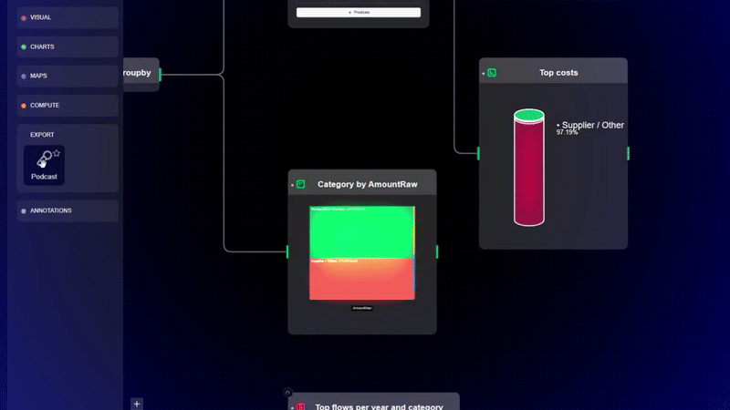
What if instead of rows and dashboards, you worked with a visual canvas? Not to make things “pretty,” but to actually see how your analysis unfolds. You drag a filter into place, and the data updates instantly. You group something, and the insight appears. You layer logic like you would post-it notes, refining as you go. Each step can be traced, adjusted, undone, branched off. It’s not about making data pretty—it’s about making your thinking visible.

And sharing? That’s not exporting a chart to PDF. It’s handing someone your flow—your train of thought—so they can walk through it too.


Can this all happen in the browser?

It sounds too good to be true. But browser technology has quietly leapt forward. With WebAssembly, WebGPU, and new APIs, it's now possible to build serious, high-performance tools that run entirely on your machine, inside your browser. No servers, no syncing, no privacy concerns. You own the data. The browser does the heavy lifting.

This means real-time visualizations. It means processing large datasets client-side. It means no installs, no logins, no barriers between you and your questions.


Our bet

This is the challenge we took on. What if exploring data was like sketching ideas on a whiteboard? What if the interface wasn’t a table or a chart, but a flow—a chain of thoughts you could see and evolve?

We built it. It’s called Datastripes.

A visual, no-code data engine that runs entirely in the browser. It’s fast, local-first, and built for people who think visually but don’t write code. You can try the interactive demo on the homepage, no signup needed. And if it speaks to you, join the waitlist—we’re opening it up soon.

We’re betting this is how data tools should feel: live, intuitive, and actually fun to use. We hope you’ll bet with us.

Forecasting and Clustering in Google Colab

· 5 min read
Vincenzo Manto
Founder @ Datastripes
Alessia Bogoni
Chief Data Analyist @ Datastripes

Data analysis often involves multiple steps — cleaning, exploring, visualizing, modeling. Two common and powerful techniques are forecasting (predicting future trends) and clustering (grouping similar data points).

In this post, we’ll show how to do both using Google Colab, walk through the code, and highlight the complexity involved — then reveal how Datastripes can simplify this to just a couple of visual nodes, no code required.


Time Series Forecasting with Prophet in Colab

Suppose you have daily sales data, and you want to forecast the next 30 days. Prophet, a tool developed by Facebook, is great for this.

The Data

Imagine a CSV like this:

dsy
2024-01-01200
2024-01-02220
2024-01-03215
......

Where ds is the date and y is the sales.

Step-by-step Code Walkthrough

# Install Prophet - this runs only once in the Colab environment
!pip install prophet

This command installs Prophet in the Colab environment. It might take a minute.

import pandas as pd
from prophet import Prophet
import matplotlib.pyplot as plt

Here we import the necessary libraries:

  • pandas for data handling
  • Prophet for forecasting
  • matplotlib for plotting
# Load your sales data CSV into a DataFrame
df = pd.read_csv('sales.csv')

You’ll need to upload your sales.csv file to Colab or provide a link.

# Take a peek at your data to ensure it loaded correctly
print(df.head())

Always check your data early! Look for correct date formats, missing values, or typos.

# Initialize the Prophet model
model = Prophet()

This creates the Prophet model with default parameters. You can customize it later.

# Fit the model on your data
model.fit(df)

This is where the magic happens — Prophet learns the patterns from your historical data.

# Create a DataFrame with future dates to forecast
future = model.make_future_dataframe(periods=30)
print(future.tail())

make_future_dataframe adds 30 extra days beyond your data so the model can predict future values.

# Use the model to predict future sales
forecast = model.predict(future)

forecast now contains predicted values (yhat) and confidence intervals (yhat_lower and yhat_upper).

# Visualize the forecast
model.plot(forecast)
plt.title('Sales Forecast')
plt.show()

You get a clear graph showing past data, predicted future, and uncertainty.

Tips for Better Forecasts

  • Ensure your dates (ds) are in datetime format.
  • Check for missing or outlier data points before fitting.
  • Tune Prophet’s parameters like seasonality or holidays for your context.

Clustering Customers Using KMeans in Colab

Now, let’s say you want to segment customers based on income and spending behavior.

The Data

A CSV with columns:

CustomerIDAnnual Income (k$)Spending Score (1-100)
11539
21681
3176
.........

Step-by-step Code Walkthrough

from sklearn.cluster import KMeans
import matplotlib.pyplot as plt
import pandas as pd

We import KMeans for clustering, matplotlib for plotting, and pandas to load data.

# Load the customer data CSV
df = pd.read_csv('customers.csv')
print(df.head())

Always check the data to understand its shape and content.

# Select the two features to cluster on
X = df[['Annual Income (k$)', 'Spending Score (1-100)']]

These columns will form a 2D space for clustering.

# Initialize KMeans with 3 clusters
kmeans = KMeans(n_clusters=3, random_state=42)

Choosing number of clusters is a key step. Here we pick 3 for illustration.

# Fit the model and predict cluster assignments
kmeans.fit(X)
df['Cluster'] = kmeans.labels_

Each customer gets assigned a cluster label (0,1,2).

# Plot clusters with colors
plt.scatter(df['Annual Income (k$)'], df['Spending Score (1-100)'], c=df['Cluster'], cmap='viridis')
plt.xlabel('Annual Income (k$)')
plt.ylabel('Spending Score (1-100)')
plt.title('Customer Segmentation')
plt.show()

The scatter plot shows customers grouped by clusters in different colors.

Tips for Better Clustering

  • Normalize or scale features if they have different units.
  • Experiment with cluster counts and validate with metrics like silhouette score.
  • Visualize results to make business sense of clusters.

Why Is This Hard for Most People?

If you’re not a coder, these steps look intimidating: installing packages, writing code, understanding APIs, and debugging errors.

Even for tech-savvy folks, repeating these steps every time the data updates is tedious.

It takes time away from what really matters: interpreting results and making decisions.


How Datastripes Makes This Effortless

With Datastripes, you don’t need to write or understand code:

  • Upload your data.
  • Drag a "Forecast" node and configure date and value columns.
  • Drag a "Cluster" node, pick features, and watch clusters appear.
  • Everything updates live and visually, directly in your browser.
  • No installs, no scripts, no errors.

Datastripes is built to turn these complex workflows into intuitive flows — freeing you to focus on insight, not syntax.

Try the live demo at datastripes.com and see how forecasting and clustering go from tens of lines of code to just two nodes.


When data analysis becomes simple, you can explore more, decide faster, and actually enjoy the process.

How to use Power BI and Datastripes for data analysis

· 6 min read
Vincenzo Manto
Founder @ Datastripes

If you’re diving into data analytics, you’ve probably heard of Power BI — Microsoft’s powerful and widely used tool. But now there’s Datastripes, a fresh platform focused on making data work simple and visual, no coding needed. Let’s break down how these two stack up, so you can decide which one fits your style and needs best.

Is Tableau still the king of data visualization up to 2025?

· 9 min read
Vincenzo Manto
Founder @ Datastripes

If you’ve worked with data, chances are you’ve heard of Tableau — a leading tool for data visualization and business intelligence. Tableau has earned a reputation for creating beautiful, interactive dashboards and handling complex datasets with ease. But what if you want something that’s easier to start with, requires no coding, and gives you full visibility into your data’s entire journey? Enter Datastripes.

Datastripes is a modern, no-code data platform designed to simplify data workflows from start to finish. Whether you’re cleaning data, creating visualizations, or generating reports, Datastripes puts everything in one intuitive, visual workspace — no scripts, no complicated formulas, just drag-and-drop simplicity combined with powerful AI assistance.

Let’s dive deeper and compare how Tableau and Datastripes stack up — so you can pick the right tool for your data adventure.

The magic of Datastripes — Easy Peasy Data Squeezy!

· 8 min read
Vincenzo Manto
Founder @ Datastripes
Alessia Bogoni
Chief Data Analyist @ Datastripes

Welcome to Datastripes, the freshest, most flexible data workspace designed for anyone and everyone who wants to master their data — without headaches, without fuss, and with a whole lot of fun! Whether you’re a data newbie, a savvy analyst, or a seasoned pro, Datastripes turns your complex workflows into a smooth, flowing adventure. Think of it like LEGO blocks for data: snap together powerful tools, build workflows, and watch insights come alive — all with zero coding stress.

At the heart of Datastripes lies a rich catalog of nodes — tiny engines of magic that fetch, transform, visualize, compute, and export data — each designed with simplicity, flexibility, and fun in mind.